A History of T&C Logos
In Taeko & Co’s two and a half years, we’ve gone through a few iterations of logos, each time being updated to better reflect the entire project.
Every logo has been made “in house”, including the latest logo, a proud product of the Grafik Dsign Club.
Taeko & Co’s Current Logo, 12th December 2022
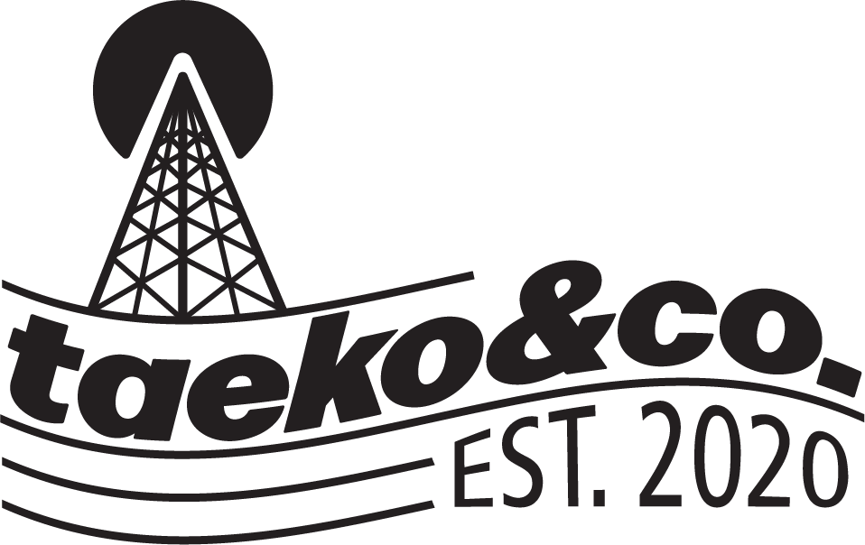
Proudly produced by the GDC (Grafik Dsign Club), this logo is T&C’s trendy new look. As is a recurring theme in each design, the main drawn element is the Atami Radio Tower, a tradition since the very first logo.
Our name is now stylized elegantly & simply “taeko&co.”, which is complimented by a heavy typeface, inspired by advertisements and posters of the 70’s and 80’s. The waves add a dynamic feeling to the logo.
November – December 2022
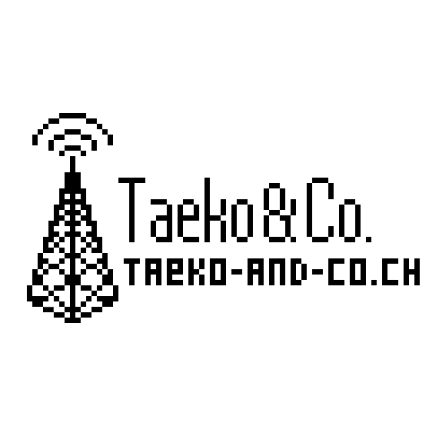
The pixel-y design was conceived on the creative test server unintentionally. It looked good enough, that it was decided it should be drawn up “properly”. Soon after, it replaced Taeko & Co’s aging old logo.
September 2021 – November 2022
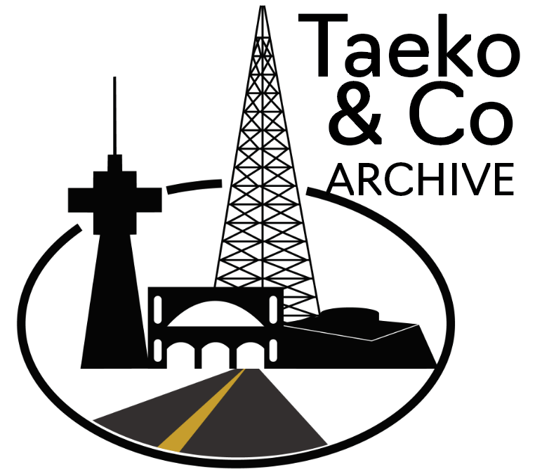
Most of this logo is defined by new developments of the late 2021 server, namely the Atami-Atocha train station and the Lyria Tower. Additionally, an ice road was added, symbolizing the exploding expansion of ice paved roads on the server.
November 2020 – September 2021
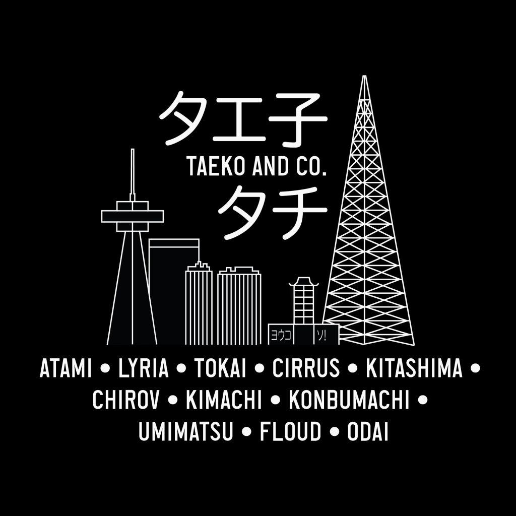
Taeko & Co’s first proper logo. Intended for the planned T-Shirts of that year.
September – November 2020
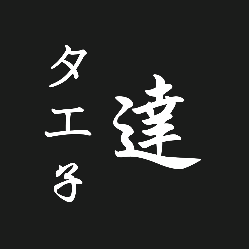
Taeko & Co’s first logo, after being renamed from RMC (Retarded Minecrafters), intended to be temporary.
