Good design resonates with us…
Design is, and always has been, at the forefront of everything we do. We believe that good, beautiful design comes hand in hand with flawless functionality, especially in the age of increasingly complex and frustratingly buggy software that is supposed to make our lives easier.
Taeko & Co. stands for meaningful, subtle, accessible and functional design. We see the beauty in towering concrete infrastructure, sleek glass high rises, modern expressive buildings, state-of-the-art tunnels and concise signage.
If you see beauty in those examples too, consider looking through our portfolio to get inspired, or maybe even contacting us about potential commissions.
Portfolio
The Taeko & Co. Logo
Our logo of course takes the first place in our portfolio. It is a proud collaboration between members of T&C and pays homage to previous logos. The heavy typeface and waviness express our identity as a free, independent design collective.
Icon of T&C Logo
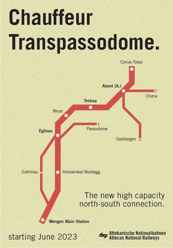
Chauffeur Transpassodome, poster for the Passodome ANR line on server
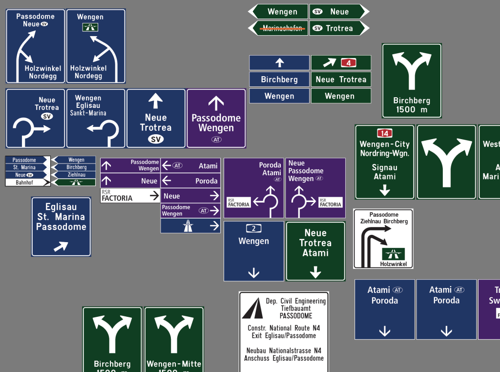
Road signs for Atteca & Swarovski, see detailed development analysis
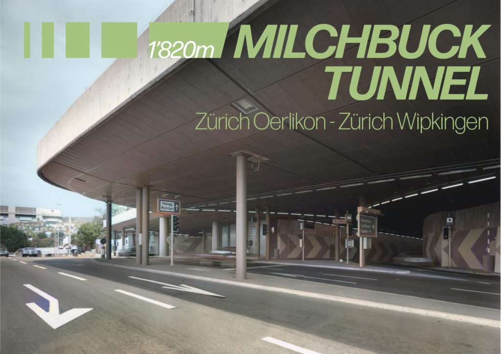
Poster for Milchbuck Tunnel in Zurich, including colorized image from ETH Archives
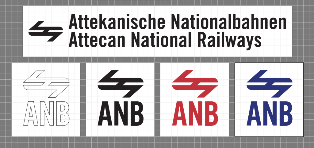
Attecan National Railways, branding/logo
